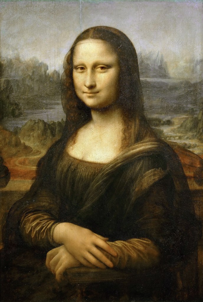
Since time out of mind, people have marveled at the mysterious Mona Lisa smile. Lovers of painting have reported for centuries that her smile changes before your eyes as if she were a living person.
I always assumed this was romantic hyperbole, but interestingly, it turns out to be demonstrably real. Moreover, it is not difficult to dissect the painting digitally and show how it works. The subtle blending of Leonardo’s famous sfumato technique is not simply a stylistic element. It is one-half of the mechanism that produces the unique mutability of the Mona Lisa smile.
In most cases I abominate the phrase, but in this special case, you really could say that the beauty is in the eye of the beholder because the technique takes advantage of the structure of the eye. Below, we’ll look at how the technique works at a semi-mathematical level, then dissect the image algorithmically to show the component parts and explain and how they are used to present the viewer with multiple versions of the image that the eye shifts between.
The code to do this is included in the article, along with hints about how to explore this mechanism farther.
I haven’t seen this explanation of the sfumato technique anywhere, but if someone else has pointed this out, please let me know.
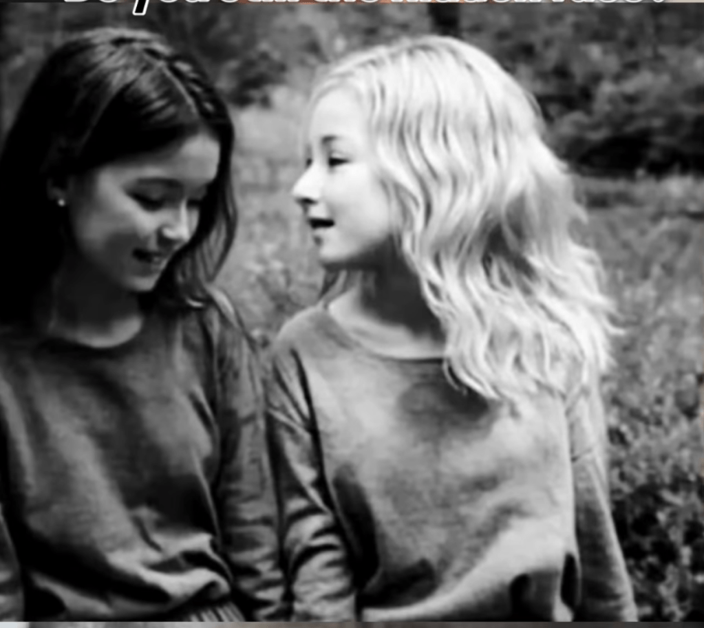
Girls
Perhaps you have seen this bizarre illusion before. It’s one of several examples of this effect that can be found online. One of the best known is an image that can be either Albert Einstein or Marilyn Monroe. Another is a picture of a hamburger and fries that can also be an image of Hitler.

The faces of the two girls are obvious, but there’s also a third face in the picture. If you can’t spot it, squint and look at the picture through your eyelashes. The third face is large, the full height of the image, and covers the girl on the right from the waist up.
There are several other ways to make the third face pop out. For instance, look at the postage stamp version below. It’s the same picture cut-and-pasted into this document, but the third face really jumps out of the smaller version.
You can also see the third face more easily if you look at it from across the room instead of at reading distance.
Another way is to look to the side of the image rather than directly at it. Point your eyes about an image-width or so to the side and the third face will be prominent, but will disappear again when you glance back at the image directly. In fact, I find that as I type this, the third face is plainly visible out of the corner of my eye, unless I glance up, in which event it disappears.
All three actions that make the third face pop out rely on the same mechanism, which we will look at below.
The image was probably created digitally, but it could have been done with conventional film photography, i.e., in a darkroom. You’ll see a hint of how this would be done in the explanation of the computation toward the end of the post.
The thesis of this post is that Leonardo used essentially the same trick to achieve the uniquely elusive, mysterious quality of the Mona Lisa. The difference is that Leonardo superimposes two versions of the same portrait that depict significantly different emotions. The basic mechanisms of sight, primarily alternately looking and looking away, cause us to shift from perceiving one to perceiving the other, creating the uncanny illusion that the smile changes before our eyes.
The relevant viewer behaviors can be very subtle and quick. Just as emotions can flow across a living face in a split second, a viewer’s behaviors that change the visible mix of the two images can be nearly instant. A viewer need not even be aware of glancing away. It happens in an instant.
The shift is subtle but powerful. The eye cannot tell the difference between a phenomenon caused by a shift of the eyes or a blink, and a real change in the image.
Leonardo did not use modern mathematics of course, but neither would a photographer producing a trick image in the darkroom. However, a little math is helpful in understanding how it works.
If you already have the general idea of how Fourier Analysis is used on images, please feel free to skip the following section.
A Tiny Bit of Math
It’s not necessary to understand the underlying math. For our purposes, you only need a general idea of what the math does, not how it does it. If you want to know more about the math itself, a deeper and beautifully produced animated explanation by the incomparable Grant Sanderson can be found here: https://www.youtube.com/watch?v=spUNpyF58BY.
About two hundred years ago, the French mathematician Joseph Fourier discovered a remarkable truth about any signal that varies over time. It’s easiest to understand this in one dimension, for instance sound, before looking at what happens in a two dimensional image.
The most natural way to picture a sound wave is as a wiggly line going from some starting time to some future time. Such a wave is pictured below.
The horizontal axis of the graph represents time moving forward, and at each instant in time, the signal, i.e., the corresponding point on the wiggly line, is somewhere on the vertical line that crosses the X axis at the given moment.
If the signal we are looking at represents a sound, the wiggle will swing up and down like waves on the ocean. The closer together the waves are, the higher the pitch, and farther the waves are from the X axis, up or down, the louder the sound. Big waves, loud sound.
Because this ordinary way of graphing a wave is all about the magnitude of the signal at each instant in time, we call this a time-domain representation of a wave.
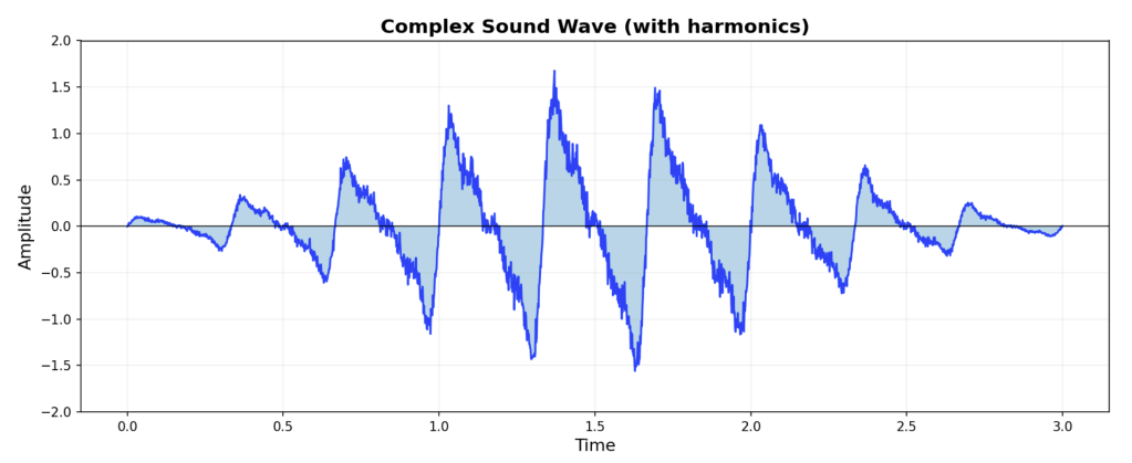
Fourier discovered that under very general conditions, such a signal can be represented in a completely different way, namely as the sum of an infinite number of sine waves. (See picture below.)
Because the most important property of a sine wave is its frequency, i.e., how often it repeats, this alternative way of describing a sound wave is called a frequency-domain representation of the signal.
The mathematical process for switching from the time-domain representation to the frequency-domain representation is called a “Fourier transform.” (There is an inverse procedure that can convert in the other direction.) We’re talking about sound here as an example, but same math applies to any signal that can be represented as a wiggling wave. No matter how wiggly and random the wave is, there is a set of perfectly regular sine waves that add up to it.
Sine waves occur in time like any other wave, but they are completely regular. That means you don’t need to give a value for every point on the curve to represent one, as you would with an arbitrary wave. All you need is two numbers, the frequency and the magnitude, and for some purposes, a third number, representing what is called the the phase, which is how much the entire wave is shifted left or right.
Therefore, while you need a Y value for every point on the X axis to represent an arbitrary wave in the time domain, the result of a transform to the frequency-domain is just a list of numbers saying how much of each frequency wave to add in.
Theoretically, you need a sum of an infinite number of sine waves to represent an arbitrary function, but in practical applications, you can usually get most or all of the information in the original wave into a finite and fairly modest sized list of sine wave frequencies. This is because most waves of interest are not infinitely variable–in the real world, action usually takes place over a limited range of underlying frequencies. Audible sound, for instance is bounded between frequencies of about 20hz to about 20,000 hz (hz or Hertz, is the number of waves per second) because that’s the range humans can hear.
Tuning forks emit sound waves that are pretty close to being sine waves, so we can picture Fourier’s claim as being equivalent to saying that if you had an infinite collection of tuning forks of all different frequencies, and you hit them each at the right instant with just the right force, you’d could hear Abraham Lincoln recite the Gettysburg Address. (It’s a little more complicated as we’ll see below.)
The illustration below shows how you get the complicated wave at the bottom from adding up the three regular sine wave above it. These waves are the sounds of our tuning forks. To compute the sum of the waves, at each point on the X axis, you just add up the up/down values of the corresponding points for wave 1, 2, and 3. Note that each of the sine waves each take only to number to fully describe: frequency and amplitude.
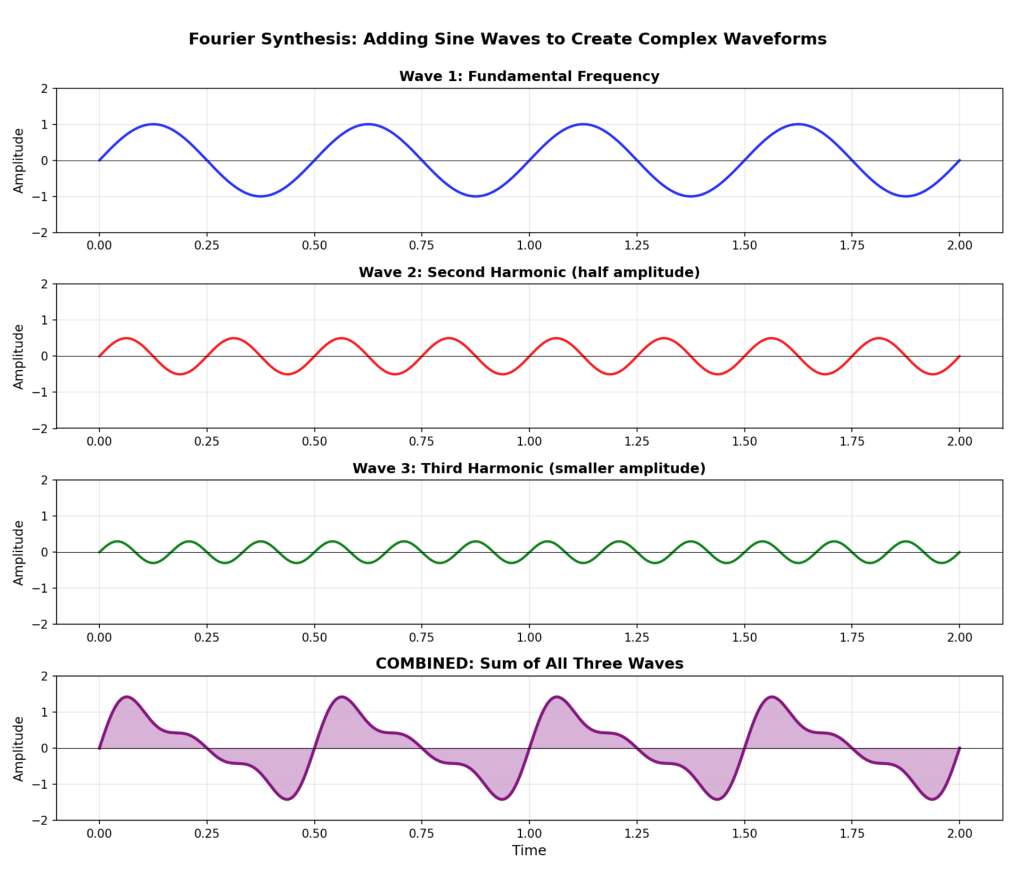
(There was one tiny wrinkle in the forgoing that ‘s easy to miss. It’s not just the magnitude for each contributing frequency. You also need a second number for the phase, i.e., how far each sine wave is shifted, i.e., the exact instant we hit each tuning fork. In this example it’s always 0. Another wrinkle is that it is only practical for short time durations. To actually get the entire Gettysburg Address out of tuning forks, you’d need to do it in a gazillion little overlapping chunks of the original recording, which is basically how it’s done in real applications.)
A variation on this called a discrete Fourier transform works with sampled data, which is what we usually have in engineering applications. The DFT does much the same thing as an FT, but it works on a finite number of data points that we have gathered by periodically measuring a signal that is actually continuous. There is much more to it, but that is as deep as we really need to go–this is about art, not signal processing.
You’ve Seen This Many Times
We are all familiar with one application of this: cleaning up the static in audio. It’s very easy to erase just the pops and clicks if you represent the data in the frequency domain. Recall that the transformed data is just a list of numbers saying how much input you need from each tuning fork to reproduce the original signal.
We can think of static as being extremely high frequency. Why? Because physically, it comes from hair-fine scratches or dust particles on the record. The needle bumping into a dust particle is nearly instantaneous compared how far the needle moves along the record groove to make normal, lower frequency notes that we actually care about in music or speech.
We can get rid of them by simply reducing or removing input from the highest frequency tuning forks. Think of it as setting the strength of the taps we will give the super-high pitched tuning forks to zero force. Sounds pitched that high are almost never a legitimate part of the music signal, so we rarely lose anything meaningful by tossing them.
When you convert the sine coefficients back to the time domain, i.e., add up all the sine waves in the right amounts to get the original recording back, like magic, the scratches are gone because we eliminated all the super-high frequency components of the signal.
What Does That Have to Do With Faces?
You can do the same thing with a two-dimensional image that we just saw with one-dimensional sound. It’s the same math.
The X dimension we called time in the time-domain isn’t time when you’re processing images–it’s just distance along the X axis. In this case, the X’s are the values in row of pixels, which are just measurements of the intensity of the light cast on tiny spots by the camera lens.
White specks on an image are the two-dimensional equivalent of audio static. They are the result of shadows from tiny flecks of dust, which means image goes from the background tone to pure white from one pixel to the next.
Removing specks is essentially the same process as removing static from a sound recording. You zero out all the super high frequency components of the image.
In real images you rarely see the image go from black to white in adjacent pixels, so most of the time you lose nothing except the speckles by tossing out the highest frequencies. If such an abrupt transition is actually a legitimate part of the image, the effect will be that the transition around that pixel simply won’t be quite as abrupt, i.e., it will be blurred a little.
Doing the Opposite of Removing Speckles
Now, consider what would happen if you did a DFT of an image and then did something almost the opposite of removing speckles, i.e., you threw away all the values except the higher-end frequencies.
What is left represents places where one tone in the picture abruptly changes into another, i.e., edges. That’s exactly how PhotoShop turns a photo into a line drawing. They transform the image into the frequency domain, remove or suppress the low frequencies, then transform it back. In the re-constituted image, the grays and blur are gone and only the abrupt changes from black to white or white to black remain.
If you do the opposite of finding lines, i.e., throw away the high frequencies and keep only the lower frequency components, then there are no edges, and you are left with only the blurs. Where we arbitrarily define the boundary between high and low determines how blurry we make the image.
Specifically With Faces
And that is the key to making that third face come and go.
A picture like that two/three girls can be made like this:
(1) The original picture of the two girls is transformed to the frequency domain and the low frequency components, i.e., the ones that represent the smoothly transitioning components of the image, are reduced or eliminated. You still have most of the meaningful data making up the representation of the two girls, which are all the details.
(2) The original picture of the third face is transformed to the frequency domain and the high frequency components are reduced or eliminated. The result is blurry compared to the image of the girls, but not so bad when seen at a distance because it’s larger.
(3) Then two sets of frequency components are merged. This means the high frequency sine values are from the image of the girls, and the low frequency values are from the image of the third face.
(4) The merged frequency-domain data is converted to time-domain data using the inverse transform, giving us the combined image, which is actually two different images.
How The Image Transforms In Your Eye
The transformation from image to image in your eye actually happens several different ways, but one of the easiest to understand it that when you squint, your eyelashes act as what engineers call a low-pass filter. The grid of tiny hairs interfere with seeing the fine-details, i.e., the high frequencies, because they are in the same general size scale, so the girls largely drop out of what we see.
The low frequencies, i.e. the larger features in the image, tend to pass through the screen of lashes mostly intact, so the third face comes through relatively strongly. If you tried to read a printed page through a window screen it would be very hard because the wires and gaps in the screen are the same general scale as the lines and circles in the type. But if you look a person just outside the window, you barely notice the screen. So, with your eyes wide open, you see only the two girls, but if you squint you see the third face.
There would be some creative details about choosing the actual images and how they are arranged so they have the right visual elements in the right places, etc. but that’s the fundamental trick.
Anything that suppresses the high-frequency components of the image tends to show the mysterious third face. Simply backing away far enough that you lose detail in the image will also do it.
The Mona Lisa Smile
Perhaps you see where we’re going with this?
Leonardo worked three hundred years before Fourier, but you don’t actually need Fourier’s math to apply the principle by hand. (Nor would you need the math to produce the effect photographically.)
The hypothesis here is that Leonardo effectively painted the subject’s face in two versions that show different facial expressions. The low-frequency version of the facial expression is what is rendered in his “sfumato” technique. Sfumato means smoke or smokey in Italian. Smoke doesn’t have sharp edges.
The smoky version of a viewed subject is easy to isolate, for one reason, as discussed above, squinting acts as a low-pass filter. However, skilled painters don’t really need that aid. It is a common exercise for painting students to draw or paint only the lights and darks, or only the shadows and highlights, using no lines.
There is no obvious analogous analog to squinting that automatically isolates the high-frequency components of what an artist sees, but normal vision supplies all the information needed to paint the more finely detailed normal view. Isolating the lines from what we see is a basic drafting skill.
The Motion of the Eye is Enough
It’s not necessary for a viewer of the painting to squint in order to perceive the shifting effect produced by seeing such an image shift.
Eye movement alone can affect which image we see because the resolution of the retina varies a great deal across its expanse.
The central part of our retina, called the macula, and in particular the region within the macula known as the fovea centralis, has much higher density of light-detecting cells than the rest of the retina (specifically more cone cells.) Therefore, it has higher resolution and is much more sensitive to details than the retina as a whole. You can see this by concentrating on one word in this paragraph while you try to read the rest. We see one word very well. To the left, right, up, or down we see very little detail outside that narrow central area of focus. One word to the right or left is already less readable, and we can’t make out any detail two words to the right or left. There is a super high-resolution area within the high-resolution zone that is tiny–closer to the size of a single letter.
The viewer looking directly at her face from an appropriate distance sees her with maximum resolution, which favors the fine detail, while the face as seen with the retinal area outside the macula, or in fact, even simply outside the high resolution fovea centralis, will show less of the detail and tend to emphasize the low-frequency version of the image. Therefore, the viewer’s eyes moving over the picture at a whole subtly shifts what they see in her facial expression.
The exact effect depends also on a few things. For one, the viewer’s distance from the painting determines how much of the image fits into the high-density areas of the retina. The viewer’s distance also affect how much detail, i.e., high-frequency components we can see. (Just as we see the third face easily in the postage stamp version.)
If at a typical viewing distance, your eye darts to a point that puts Mona Lisa’s face outside that high-resolution area of the retina, you will see a subtly different facial expression via the side of your eye, but as your eye darts back, the image reverts.
The genius is less in Leonardo’s manual technique (although his manual skills were regarded by his peers as being unsurpassed) than in his uncanny intuition that his technique would produce the magic effect of having the picture subtly morph back and forth.
Dissecting the Mona Lisa Smile
It is one of the many miracles of our age that you don’t need to be able to program a computer anymore, or indeed to even know very much about math, let alone fancy signal processing, to use advanced math as a tool. You can just tell the computer what you’re trying to do and AI will code it up for you.
And thank God.
I haven’t done this kind of programming in a while, so who knows how long it would have taken me to get this program working the old fashioned way. It’s a simple program, but you need to know all the painful details of what libraries the math routines are in, what functions take what arguments, how to apply them, etc. It adds up to a chore I’d probably never get around to on my own.
Therefore, I asked the AI Claude Sonnet 4.5 to whip up a Python program to break down a black and white image of La Giaconda’s face, and apply both high pass and low pass filters to it so we could see if this is indeed what Leonardo did.
It only took about couple of paragraphs of typing to get Sonnet to write the program, and a little more back and forth to get it to run it for me. I had the first computational results within an hour of getting the notion to try it. The time to completion included finding a high-resolution image that was in the public domain, cropping it with Gimp, etc. In this case, it was only a matter of knowing what to ask for–Sonnet needed essentially no input relating on the details of how to do it.
The program does not implement the separation by literally zeroing out the high frequency and low frequency values using Fourier transforms as described above, but the technique used produces a similar frequency separation by a computation that corresponds more closely to what the painter would have done manually. Computation details are explained at the end.
The photo centered below is the black and white original I worked from.
Below that are a pair of low-pass and high-pass versions. The high-pass version is almost outlines, because it shows where the rapid changes from light to dark occur in the raw image. At the risk of belaboring the point, the low-pass version is blurry because it removes all the abrupt changes that you see in the high-pass version. Keep in mind that these are quite small on the page compared to the original, so we’re already introducing at least some of the visual effect we’re discussing simply by showing the images smaller than life.
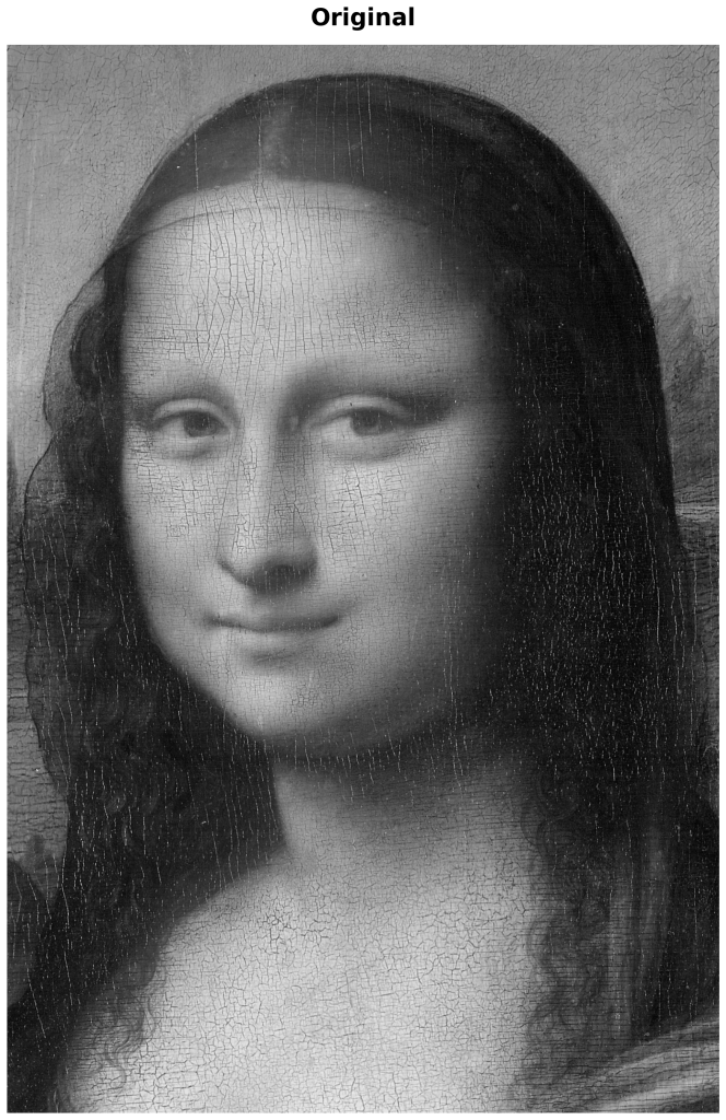
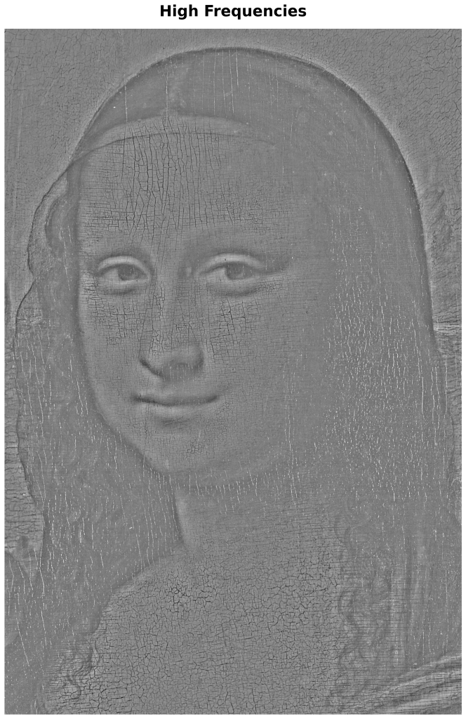

The original photo was cropped from a high resolution image courtesy of the Creative Commons File:Mona Lisa, by Leonardo da Vinci, from C2RMF.jpg. They are reprocessed here with sigma=20, as explained in the appendix.
The spoiler is right there in the images. The facial expressions in the low-pass and high-pass versions are strikingly different in coherent ways. I found that the more I looked, the more apparent the differences between the expressions are.
Below, we look systematically at some of the specific differences in the components of the two facial expressions.
We’re not going to get too deep into why Leonardo chose the particular facial expressions he used for each version. There is a poetic sense to his choices, but what matters for our purposes is that the expressions are systematically different across the two frequency ranges, and that the details of the expressions group coherently in the two versions. In other words, the components of the facial expression in each version make emotional sense together and as a group contrast with the sense of the analogous components in the other expression.
The technical specifics on facial mechanics cited here come mostly out of the Facial Action Coding System (FACS), which is a standard reference for the meaning of facial expressions and the muscle actions that produce them.
You may want to refer back to the dual images above as you consider the specific features.
It is worth remembering that in these reproductions, even on a full size computer screen, may be significantly smaller to the eye than the image would be in the setting it was intended for, which is a Florentine domestic interior. Just as the third face is immediately visible in the postage-stamp image of the girls, the smaller the screen, the weaker will be the effect in the images of the Mona Lisa.
The smaller the image on your device, the less evident Leonardo’s illusion will be when looking at the full image because the low-frequency version will tend to dominate.
One obvious implication is that the painting as displayed at the Louvre would greatly conceal the magical effect because the low-frequency version would never be fully hidden at the fifteen or sixteen meters distance of the velvet rope from the painting.
Eyebrows
The eyebrows represented in the low-pass version are in a classic configuration produced by the combined actions of the corrugator supercilii muscle, which pulls the brows downward and inward, and the frontalis muscle which pulls the inner part of the brows upward toward the hairline. This expression is described in detail in Action Unit 1 (AU1) of the FACS.

This motion of the eyebrows tends to show distress, sadness, haplessness, and vulnerability and is referred to in the context of illustration and animation as the puppy dog brow. This expression is all over contemporary Disney animation, where it is used to convey tenderness or adorable haplessness, particularly when the main characters are charming each other.
In contrast, the puppy dog brow is hardly visible at all in the high frequency version of the image. In fact, in both the original and the high frequency versions, slightly arched eyebrows can be seen that are absent in the low frequency version. The slight arching of the eyebrows is also slightly asymmetric, with her left eyebrow a tiny bit higher, giving her a slightly amused expression, which is entirely absent in the low-frequency version.
Mouth
In the low frequency version we see a pronounced display of expression AU-12, which is a slight pulling up the corners of the mouth by the zygomaticus major muscles. It is done without enough force to lift the cheeks or produce a broad grin. For most of its width the line between the lips is quite flat. We only see a slight curling upward at the corners producing a faint, almost watery smile. You can try this yourself. Just allow the muscles that pull up on the corners of the mouth to contract a little, so you get the corners curling up without significantly affecting the cheeks.
This is often part of an expression of bittersweet emotion or feelings of sad affection, resignation, and compassion mixed with pain. It might be seen in a person accepting loss, expressing love they don’t expect to be returned, etc. Its pairing with AU1 in the low frequency image is highly consistent.
Note that in the high frequency picture, the corners of the mouth hardly turn up at all, but rather, the entire mouth forms a gentle banana-like curve, giving a more natural pleased smile. This is consistent with the depiction of the eyebrows in the high frequency image.
Eyes
A genuine smile of pleasure shows in the bunching of the cheeks as much as in the shape of the mouth, and it is always accompanied by a very distinctive contracting of the orbicularis oculi muscles that ring the eye, as in the AU6 expression.

The AU6 action raises the cheeks, compresses the skin under the eyes and produces a bulging under the lower eyelids. It also produces crows feet, particularly in a mature person. This kind of smile accompanies positive feelings and communicates the joy of a smiling person through the eyes even if the rest of the face is hidden. It is the hallmark of what is known as “the Duchenne smile.” It is a positive, genuine and emotionally straightforward smile involving the whole face.
Note how much more pronounced is this collection of effects in the high frequency version and how relatively absent they are in the low frequency version.
Taken Together
Overall, the combination of eyebrows, eyes, smiles, and cheeks form two tight patterns of strikingly differing expressions.
The expression that comes through in the lower frequencies is somewhat wounded, tender, and vulnerable, while the expression that comes through in with the higher frequencies is confident and strikingly happier, smiling but not grinning, with the pronounced bunching under the eyes that is characteristic the Duchenne smile.
Note also the rounded appearance of the cheeks in the higher frequency version. This is another facial expression component that is typical of joy or pleasure, and is again, a feature of the Duchenne smile. In contrast, there is no bunching of the cheeks in the low frequency version, where the lady’s face appears to be almost gaunt.
The net effect is the high-frequency expression, the on you see at first glance is happy, confident, and very slightly amused. It is a face a woman might wear in company. The low-frequency face that flits by when you shift your eyes, is tender, even wounded, and sad. It is a face a woman would show only in private.
It is absolutely extraordinary that Leonardo was able to produce this effect by hand, essentially painting two different versions of the same face in different frequency registers. It’s an astounding feat of observation and a remarkable intellectual feat.
By tricking the eye into seeing a sequence of facial expression in static paint on a panel, Leonardo managed the extraordinary feat of painting in a four dimensions.
The only comparable artistic feat that comes to mind is Gian Lorenzo Bernini’s 1621 marble bust of Scipione Borghese, Pope Paul V, in which the great master sculpted the color blue in the Pope’s eyes and visually embedded him in an interior space. The trick is outlined in Many Kinds of Realism. (Bernini executed the piece twice because a flaw in the stone became evident when the first was nearly complete. The second version is generally regarded as the livelier of the two.)
How the Code Works
I did not write the code appended below. I described what I wanted to Claude Sonnet 4.5, which generated the Python program below in a couple of minutes.
If you just want to fiddle around, or lack the skills to run it manually, you can simply ask Sonnet or GPT to run it for you. Sonnet will be happy to do so if you supply the image. The high-resolution image I used is cited above so you can download it and crop it as you please.
Since this version is known to work, you can upload it to ensure that you get comparable results, or you can just get Sonnet to write it from scratch. The code here produces six versions, and six is hard-coded in as a value. If you want only the three versions I’ve used here, Sonnet will gladly modify it to suit. If you intend to experiment, it might make sense to have Sonnet set it up as a command line program you can call with whatever arguments you might want to vary.
Note that the first three lines import the libraries for doing math and laying out the result. The real action is all inside those libraries where you can’t see it. The rest is just boiler plate and glue-code.
The Gaussian Blur: The Low Frequency Part
Most of the work is done by applying what is called a “Gaussian blur,” which is a mathematical way of smoothing an image. The algorithm takes each pixel and averages it with nearby pixels in such a way that nearby pixels contribute more and distant pixels less. This contribution of neighboring pixels to the value computed for a given pixel follows a bell curve pattern (called a Gaussian distribution).
We use this technique because it is conceptually close to how one would approach the problem by hand, while the Fourier version is decidedly not.
What the Blur Does
The blurring operation removes fine details while preserving the overall structure. Sharp edges become softer gradients. Texture disappears. What remains is the the broad shapes and tones, i.e. the lower frequency components. Take to an extreme, the image would be blurred beyond recognition.
Extracting High Frequencies
We get the high frequency components by subtracting the low frequency components from the original image pixel by pixel.
This operation removes from the original everything that the blurred version retained. If an area was all blur in the original, in the high-frequency version it will simply be background white.
What remains is all the relatively fine details and edges. We then shift this to a neutral gray and adjust it so it is visible as an image. The result is the high frequency image.
Note that an artist does not need to do something analogous. A skilled draftsman or painter can draw something like the high frequency version directly.
Sigma: The Goldilocks Parameter
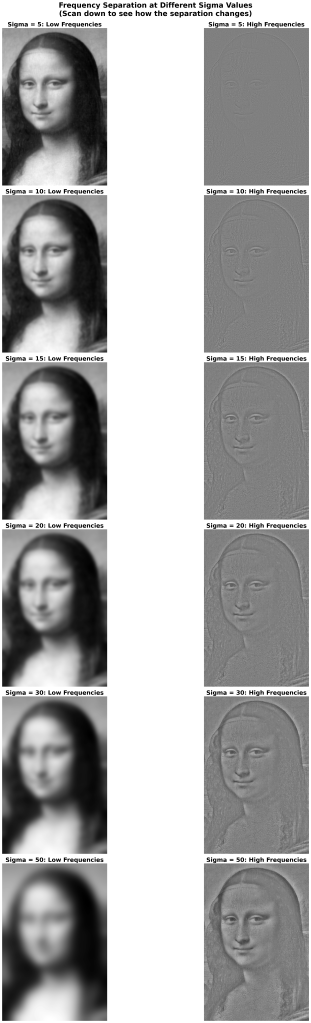
The most important parameter in this process is called sigma (σ), which controls how much blur you apply. This is the parameter that defines the boundary between “low frequency” and “high frequency.”
A small sigma like 5 only slightly blurs the image, so the high frequency version only gets the sharpest details.
A very large sigma, like 50 gives a heavy blur by munging together the values over a wide area of the original. A value of 50 blurs away almost all the meaningful information.
As most of the visually meaningful information is left in the high frequency version, the high frequency version tends to look a lot like the original.
Somewhere in between will be a value for sigma that shows the most contrast between the facial expressions that come through with the low and the high frequency versions.
To my eye, the optimal low-frequency version that looks the most different from the higher frequency versions while still being visually readable has a sigma at roughly 15 to20, while the higher frequency version seems to have those properties at a slightly higher value of sigma between 20 and 30. Your mileage may vary.
The following pairs of images are the low and high frequency versions for a range of values of sigma.
Directions
We have seen that the difference in facial expressions between the high-pass and low-pass versions are strong, and each version exhibits a coherent clustering. There’s nothing random looking about the two collections of expression components. They make sense together.
There are other issues that have been left unexplored.
Sigma(s)
This two examples shown above separate the low and high frequency images based on the parameter sigma that defines the borderline between high and low frequency. The two images were derived using the same value for sigma, but this was a choice for simplicity.
The two versions of the image need not share that parameter, and it is possible that the effect is optimal using different versions of sigma for the two images. This possibility might be worth exploring, both in terms of esthetic power and understanding the relationship of sigma to the mechanics of vision. We touch on this below in section How the Code Works.
Psychology of the Expression Choices
The psychology underlying Leonardo’s choice of expressions is another interesting area of investigation. Why is that particular pair of expression powerful? The FACS describes static expressions, i.e., what can be seen in an isolated instant, as in a photo, but facial expressions occur in time and the transition from one to another conveys information that is not present in static representations.
Display of the Original
The low-frequency versions pop out more strongly both with smaller images and with distance from the image for the same reason (as described above for the image of the little girls.) I used a value of sigma that made it convincing on a printed page. The particulars might change somewhat for a full size image on a wall.
The real painting is exhibited today at a very unnatural distance compared with what would be found in a Florentine interior in the early Sixteenth C. This distance presumbably has two effects:
Firstly, it would tend to subtly emphasize the low-frequency aspect of the image, making her appearance more plaintive or tender than the artist intended.
Secondly, it would show it to disadvantage with respect to the image appearing to change. You’d see a more tender, plaintive expression than you would in a drawing room, and it would tend to lose its magic because it was painted to be seen at a more intimate distance.
Color
Another factor that is not explored above is color. In principle, the manipulation of frequency registers need not be the same across the spectrum. This could be important because color and pallor also communicate emotion.
One suspects that the last of these was not done, but some research would be needed to demonstrate it.
The reason that it is improbably, apart from multiplying the difficulty, has to do with how paintings were typically done in the late Fifteenth and early Sixteenth Centuries.
It is common today to paint “a la prima” which basically means, in one go. Paint is applied wet-on-wet directly onto a prepared canvas, or sometimes onto a canvas on which the painting has already been blocked out either in color or in a simplified monochrome chiaroscuro, usually with very thin paint.
In Leonardo’s time, most portrait paintings were first under-painted to a high degree of finish in monochrome. When the monochrome underpainting was dry, glazes of color and further details were applied. The so-called grisaille (which means gray) allowed the artist to work out the forms before adding the complexities of color and also served to unify the painting with a consistent under color. (The underpainting is not necessarily gray–blue or green are also common.)
Grisaille would be a very natural way to work out the subtleties of the two-level technique that Leonardo seems to have used, particularly the low-frequency components. The essentially monochrome nature of grisaille and the unifying quality of the technique on the finished image argue for the probability that the low-frequency version was worked out in monochrome rather than differently across the color spectrum, but confirming that is an open question.
The Python Code
This is the code that generated the above images. The comments are more informative than the code itself, which is mostly function calls to canned routines in the Python numpy computational library.
import cv2import numpy as npimport matplotlib.pyplot as plt# Load the high-resolution face imageimg = cv2.imread('path/to/mona_lisa_face.jpg')gray = cv2.cvtColor(img, cv2.COLOR_BGR2GRAY)# ============================================================================# GAUSSIAN BLUR - LOW-PASS FILTER# ============================================================================# The Gaussian blur is a weighted average of each pixel with its neighbors.# The weights follow a bell curve (Gaussian distribution) centered on the pixel.# # Sigma (σ) controls the width of this bell curve:# - Larger sigma = wider curve = more blur = lower cutoff frequency# - Smaller sigma = narrower curve = less blur = higher cutoff frequency## The kernel size must be large enough to capture the spatial extent of the blur.# Rule of thumb: kernel_size ≈ 6 * sigma (rounded to nearest odd number)# ============================================================================sigma = 20kernel_size = 71 # Must be odd: (71, 71) means a 71x71 pixel neighborhood# Apply Gaussian blur - this creates our LOW-FREQUENCY image# This preserves gradual changes (low spatial frequencies)# and removes rapid changes (high spatial frequencies)low_freq = cv2.GaussianBlur(gray, (kernel_size, kernel_size), sigma)# ============================================================================# HIGH-PASS FILTER - EXTRACTING FINE DETAILS# ============================================================================# The high frequencies are everything the blur removed.# We get them by subtracting the blurred image from the original:## High_Freq = Original - Low_Freq## This isolates edges, texture, and fine details.# ============================================================================# Subtract to get high frequencies (use float to avoid clipping negative values)high_freq = gray.astype(float) - low_freq.astype(float)# Shift to middle gray (128) so the image is visible# (otherwise it would be mostly dark with both positive and negative values)high_freq = high_freq + 128# Clip to valid pixel range [0, 255] and convert back to integerhigh_freq = np.clip(high_freq, 0, 255).astype(np.uint8)# ============================================================================# FREQUENCY SEPARATION PROPERTIES# ============================================================================# Key relationship: Original = Low_Freq + (High_Freq - 128)# # The cutoff frequency is approximately 1/sigma (in appropriate units)# # All frequencies are present in both images, but with different weights:# Low frequencies: mostly in low_freq, slightly in high_freq# High frequencies: mostly in high_freq, slightly in low_freq# # This is a smooth separation, not a hard cutoff (unlike ideal filters)# ============================================================================# Save or display the resultscv2.imwrite('low_frequencies.png', low_freq)cv2.imwrite('high_frequencies.png', high_freq)# Display side by sidefig, axes = plt.subplots(1, 2, figsize=(12, 6))axes[0].imshow(low_freq, cmap='gray')axes[0].set_title(f'Low Frequencies (sigma={sigma})')axes[0].axis('off')axes[1].imshow(high_freq, cmap='gray')axes[1].set_title(f'High Frequencies (sigma={sigma})')axes[1].axis('off')plt.tight_layout()plt.savefig('frequency_separation.png', dpi=150)plt.show()